KPI Dashboard Guide for Management: What to Measure
A KPI dashboard guide for management: how to choose metrics, integrate data, and turn fragmented reports into fast, everyday operational decisions.
A sales director sees revenue growing, the operations manager reports delivery delays, and the finance team finds margins falling. If every function works from different spreadsheets, the management meeting becomes a discussion about the numbers before anyone even gets to decisions. A KPI dashboard guide for management exists precisely to prevent this waste: to create a shared, up-to-date, and reliable view of what is really happening in the business.
A dashboard is not just a more attractive report. It is an operational tool that connects objectives, data, and actions. When designed well, it reduces the time needed to identify a problem, clarifies who needs to step in, and makes the impact of decisions measurable. When designed poorly, it adds noise: too many metrics, inconsistent data, and charts that help no one make a choice.
Start with the decisions to be made, not with the data available
The most common mistake is to start with the list of data available in the CRM, business management system, e-commerce platform, or production software. The result is often a crowded dashboard, built around the systems rather than management priorities.
The right starting point is different: which decisions need to be made faster and with less uncertainty? For a sales-focused company, this may mean understanding where the sales funnel gets stuck. For a manufacturing company, it may mean monitoring production capacity, on-time delivery, and margin by job. For a business with multiple locations, it may mean comparing performance, costs, and service quality without waiting for the monthly close.
Every KPI should answer a specific question. If it does not prompt a possible action, it is probably an interesting metric but not a priority for the management dashboard. Website visits, for example, are valuable only when linked to qualified inquiries, conversions, or acquisition cost. Displaying them on their own risks shifting attention to a vanity metric.
KPIs, metrics, and targets are not the same thing
A KPI is a metric that is critical to an objective. Revenue can be a KPI if the objective is growth, but it is not enough to tell whether that growth is sustainable. It needs to be considered alongside margin, pipeline, collection times, repeat purchase rate, or sales costs, depending on the business model.
The target defines the desired level. The alert threshold, by contrast, signals the point beyond which it is appropriate to intervene. Distinguishing these three elements prevents decorative dashboards: a value without a time comparison, objective, or threshold offers no clear direction.
KPI Dashboard Guide for Management: The Essential Areas
An effective management dashboard typically covers a small number of areas, with carefully selected, consistent KPIs. The exact number depends on the complexity of the business, but for management it is often preferable to have eight to fifteen key indicators on the main screen, with details left to drill-down views.
Financial performance
The aim here is not to replicate the income statement, but to identify significant variances early. Revenue and gross margin should be viewed by period, channel, customer, product, or job when these dimensions drive strategy. Revenue growth accompanied by shrinking margins calls for a different response than balanced growth.
Other useful metrics include forecast cash flow, average days sales outstanding, overdue receivables, and profitability of open projects. For companies that work on projects, tracking earned margin against budgeted margin is often more useful than revenue alone.
Sales and business development
Management needs to be able to monitor the health of the sales process, not just the end result. Pipeline value, weighted probability, conversion rate by stage, average sales cycle, and average order value show where to intervene.
A large pipeline is not automatically good news. If opportunities stagnate for too long, the close rate falls, or the team focuses its efforts on low-margin deals, the forecast may be optimistic. An effective dashboard highlights both the volume and the quality of opportunities.
Operations, quality, and capacity
In companies where the commercial promise depends on execution, operational KPIs carry significant weight. Fulfillment times, on-time deliveries, backlog, resource utilization, error rate, returns, and open tickets can provide early warning of margin loss and customer dissatisfaction.
There is no universal set. A service company may monitor hours delivered against hours sold and profitability by project. An e-commerce business will look at order preparation times, returns, and logistics cost per shipment. The principle remains the same: choose indicators that make the bottleneck visible before it becomes a problem for the customer.
Customers and retention
Acquiring new customers is expensive. That is why a management view should also include renewal rate, repeat purchase rate, churn, customer portfolio value, and trends in support requests. If the data allows, it is useful to segment by cohort, industry, geographic area, or account manager.
Net Promoter Score can be an interesting signal, but it should not be the only indicator of customer experience. It should be viewed alongside response times, the percentage of requests resolved on first contact, and the main causes of support tickets. Feedback becomes useful when it is connected to a process that can be improved.
Integrated data: the requirement that determines reliability
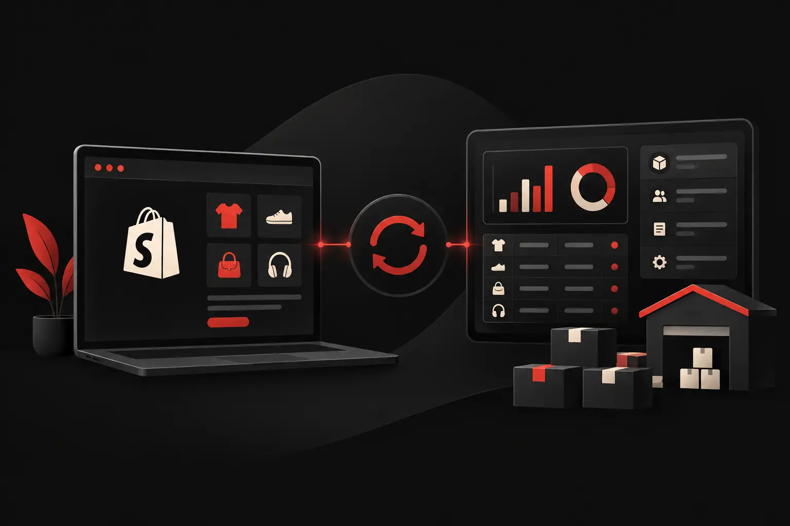
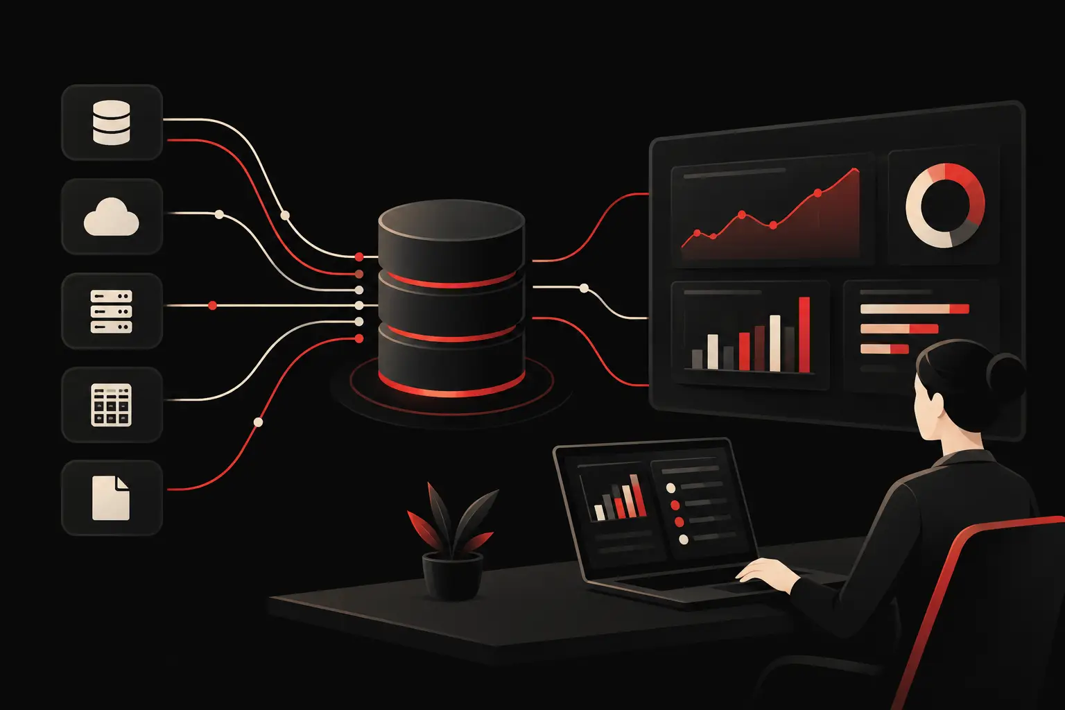
A dashboard is only as good as the data that feeds it. If the CRM, ERP, e-commerce platform, advertising platforms, and support software do not communicate with one another, the team loses hours exporting files, reconciling records, and debating which version is correct.
Integration is not simply a matter of connecting APIs. It requires shared rules: a single definition of a qualified lead, revenue attribution criteria, duplicate management, record updates, and accountability for data quality. Without a minimum level of governance, automation also makes errors happen faster.
It is useful to define the source, formula, update frequency, and business owner for each KPI. This documentation reduces ambiguity and makes it possible to evolve the dashboard as processes, channels, or objectives change. Some decisions require near-real-time updates; for others, it is more appropriate to work with validated daily or weekly data. Pursuing real time at all costs increases complexity and costs without always creating more value.
How to design a dashboard people will actually use
The visual hierarchy should reflect the hierarchy of decisions. On the first screen, management should be able to quickly see performance against target, significant variances, and trends. Details come later: filters for period, area, business unit, customer, or product make it possible to analyze causes without weighing down the initial view.
Design also serves an operational purpose. Colors, labels, and charts should reduce interpretation time, not add effects. Used thoughtfully, red can signal a problem relative to a threshold; used everywhere, it loses meaning. Tables are useful for detail, while a line chart makes a time trend and comparison between target and actual clearer.
The dashboard should also reflect people’s roles. The CEO needs a cross-functional overview; the sales manager needs pipeline detail; operations leaders need to be able to isolate delays and anomalies. A single identical screen for everyone may seem efficient, but it often does not support the work people actually do. The best solution is a shared core, with function-specific views and appropriate access levels.
From dashboard to management routine
No dashboard improves results if it is only opened before a board meeting. Its value emerges when it becomes part of a routine: weekly priority reviews, monthly variance analysis, assigning actions, and subsequently checking their impact.
Every significant anomaly should prompt a concrete question: is it an isolated event, a process problem, or a trend? This leads to a plan with an owner, a deadline, and a verification metric. If the conversion rate falls, for example, it is not enough to highlight it in red: you need to understand whether the cause lies in lead quality, response times, the offer, or the sales team’s capacity.
A custom solution makes it possible to build this connection between data and process, integrating business data sources, workflows, and alerts according to actual priorities. This is the kind of approach Graffico uses to turn fragmented data into control tools designed around how the business really works.
The right dashboard should not impress the person looking at it. It should make it easier to make the right decision while there is still time for it to make a difference.
Ready to bring your ideas to life?
Request a free, no-obligation consultation. Let's talk about your project.
Request a consultation