Paid to respond: how Surveys’ UX is turning your data into currency
Stop giving your data away. With the Surveys app on World Network, every answer comes with a price in Worldcoin. A case study on how an “ultra-fast” design and dark aesthetics can turn the tedium of surveys into a stream of micro-earnings.
We’re in the era of “Human Verification,” and Sam Altman has understood one fundamental thing: if you want quality data from real humans, you have to pay them. But to do that without boring them, you need an interface that feels like a video game, not a bureaucratic form.
The brief from microfeller® studio for the Surveys app was brutally simple: make the earnings immediate and the effort negligible. Part of the Worldcoin ecosystem, this mini-app isn’t just another market research tool. It’s a piece of the attention economy’s infrastructure, where users earn tokens while companies get insights certified by “verified humans.”
The chaos of traditional surveys: why nobody answers anymore
The survey market is broken. Companies spend fortunes on data that is often fake, incomplete, or filled out by bots. This creates systemic disorder:
Endless friction: Long, white, boring forms that look like they were made for a 2005 PC. Users leave after the second question.
Lack of incentives: “Take part and you could win a voucher.” In 2026, “could” is no longer enough. People want a guaranteed, immediate return.
Dirty data: Without identity verification (such as the kind offered by World ID), companies pay for opinions generated by algorithms, making the results useless for business strategy.
The cost analysis: how much does a “slow” interface cost you?
If you’re building an app where people have to perform a repetitive action, every millisecond of delay is a loss of profit.
Here’s the financial blow dealt by bad UX:
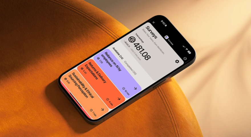
Funnel abandonment: If it takes a user more than three seconds to figure out how much they’ll earn from a survey, they’ll close the app. Surveys addresses this by clearly showing the earnings and estimated time on each card.
Data acquisition costs: The more complex the interface, the more you have to “buy” users’ attention with high rewards. A smooth, pleasant interface lets you collect data with smaller incentives too, because friction is minimal.
Business-side inefficiency: If the manager creating the survey has to read a 50-page manual, you’re wasting operational time. The Surveys console is a structured grid that eliminates the need for training.
The solution: “Midnight” aesthetics and a single-screen focus
microfeller® studio’s approach breaks away from the usual “sterile” white of analytics tools.
Midnight Navy and Teal: Using a midnight-blue background with cyan and teal accents isn’t just about aesthetics. It creates a high-contrast environment that focuses users’ attention, making survey cards feel almost “hypnotic” and premium.
One question at a time: Zero visual noise. One question per screen, huge buttons, and a linear flow. It’s design made for thumb speed.
Wallet integration: Earnings go straight into the World App wallet. The UX closes the loop: action -> instant gratification.
Graffico’s Output 🔴
At Graffico we admire the consistency of this system. It turns a product that could seem like a prototype into a polished, professional asset.
The lesson for your business:
Reduce decision time: Users need to know what they get in under 3 seconds.
“Dark” design communicates value: If you want an app to feel like a financial or rewards tool, use deep colors and bright accents.
Make users feel like partners: Paying for attention isn’t a sign of weakness; it’s recognition of the value of other people’s time.
UX isn’t just about how an app looks; it’s about how quickly it turns an intention into a result.
Ready to bring your ideas to life?
Request a free, no-obligation consultation. Let's talk about your project.
Request a consultation