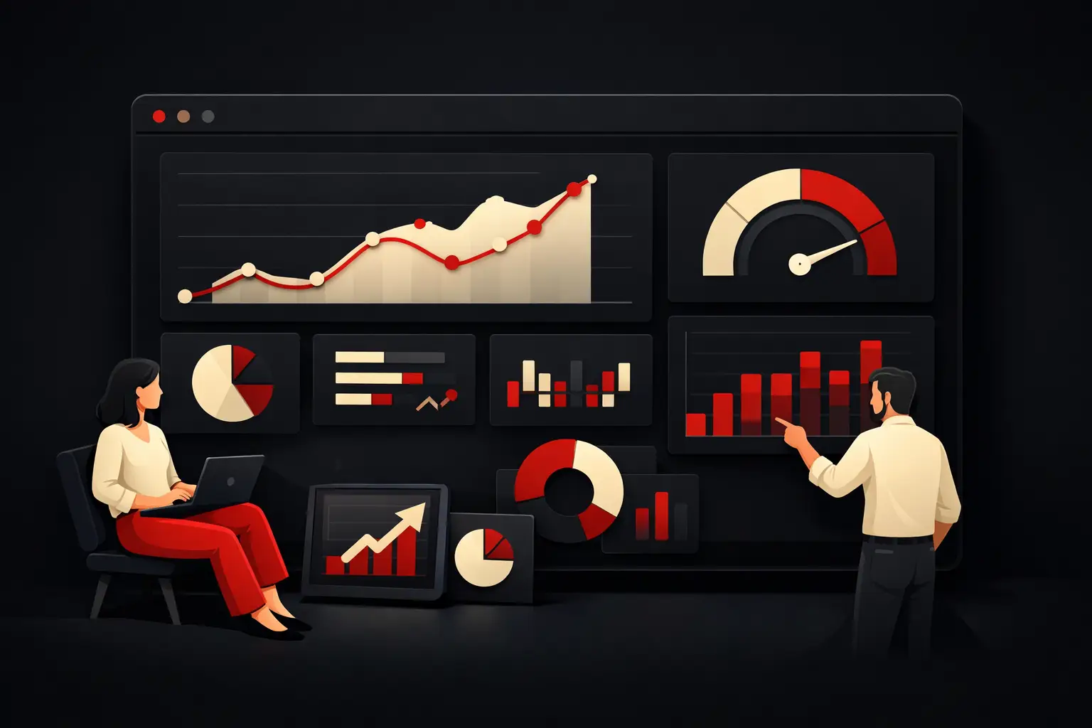
How to Build a Custom Business KPI Dashboard
Custom business KPI dashboard: how to design a useful, readable system connected to your processes so you can make better decisions faster.
When a CEO asks for the numbers for the month and receives three Excel files, two screenshots from the business management system and a different answer from every department, the problem isn’t the data. The problem is the absence of a custom business KPI dashboard built around the way the company actually works, sells and makes decisions.
Many companies already have digital tools: CRM, ERP, e-commerce, accounting software, marketing platforms and shared spreadsheets. Yet they continue to operate with only partial visibility. The data exists, but it is fragmented, viewed too late or presented in a way that doesn’t help decision-makers. A well-designed dashboard isn’t there to show more numbers. It’s there to reduce noise, highlight what matters and connect strategy to operations.
Why a custom business KPI dashboard really changes how you manage
The difference between a standard dashboard and a custom solution comes down to context. A generic template can show revenue, leads, costs or margins. But it doesn’t know the bottlenecks in your sales process, where production delays are building up, which tickets are taking up the most customer support time or how much the average fulfillment time affects repeat orders.
A custom dashboard translates your business model into a system for understanding performance. That means choosing KPIs that align with real objectives, bringing together different data sources, setting alert thresholds, segmenting by branch, product, sales agent or channel, and making everything easy to read without forcing management to interpret complex information every time.
The benefit is not just aesthetic or organizational. It’s economic. If a critical data point emerges a week late, the cost is reflected in lost sales, internal inefficiencies or decisions based on perceptions instead of evidence. A well-designed dashboard shortens the time between signal and action.
The right KPIs aren’t numerous; they’re useful
One of the most common mistakes is filling a dashboard with metrics to create the impression of total control. In reality, more indicators don’t mean more clarity. Often, they just mean more distraction.
KPIs should answer specific questions. How much are we selling compared with our target? Where is the sales funnel getting stuck? Which customers generate the highest margins? How many manual tasks are slowing the team down? What is the true acquisition cost by channel? If a metric doesn’t support a decision, it usually doesn’t deserve a place in the main view.
That’s why an effective dashboard starts with the process, not the software. First, you analyze business workflows; then you define the indicators that measure performance, risks and opportunities. Only after that does it make sense to design the visualization.
Different roles need to see different things
Senior management needs a concise, cross-functional view. It wants to understand trends, variances, margins, productivity and operating cash flow. A sales manager needs the pipeline, conversions, average deal size, time to close and performance by agent. An operations manager looks at lead times, capacity utilization, SLAs, errors, rejects and fulfillment.
That’s why a custom business KPI dashboard shouldn’t be a single screen that looks the same for everyone. It should be a system of consistent views, with different levels of detail depending on the role. Presenting the same data in the same way to everyone risks making it useful to no one.
Where the data comes from—and why integration matters more than layout
Many dashboards look great in demos and become useless after a few months. The reason is almost always both technical and organizational: the data isn’t properly integrated.
If information comes from disconnected tools, is updated manually or follows different logic across departments, the dashboard inherits those same problems. It may display numbers that look neat on paper but are fundamentally unreliable. And when trust in the data breaks down, management goes back to offline files and manual checks.
Avoiding this scenario requires solid integrations between data sources. CRM, ERP, e-commerce, ticketing software, accounting, marketing automation, production systems and logistics systems need to communicate according to clear rules. A consistent data structure must be defined, with shared naming conventions, deduplication, correct hierarchies and synchronization suited to the type of decision. Some companies only need a daily update. Others, such as those in retail or operations management, need data that is almost real time.
Layout matters, but it comes later. An elegant dashboard built on uncertain data only creates the impression of order in the chaos.
How to design a custom business KPI dashboard
Effective design follows a consultative approach, not a purely visual one. The first step is to understand which decisions need to be made faster or with less room for error. This changes everything because it shifts the focus from reporting to operational control.
Start by mapping key processes: sales, delivery, customer support, administration, supply chain and marketing. For each area, identify objectives, friction points, tools used and how often decisions are made. This is how you uncover the KPIs that are truly strategic and those that are merely supplementary.
The second step is data modeling. You need to define what each indicator measures, where it comes from, which formula is used to calculate it and how often it is updated. This phase is less visible, but it’s what separates a reliable dashboard from a well-formatted demo.
Then comes the interface. The best rule is simple: less interpretation, more clarity. Use colors thoughtfully, establish clear visual hierarchies, flag variances, make filters easy to understand and ensure time comparisons are readable. A good dashboard reduces the time needed to see whether something is going well, poorly or outside the threshold.
Finally, there’s internal adoption. Even the best technical solution will fail if no one uses it in meetings, sales follow-ups or decision-making. That’s why it needs to become part of company routines: weekly reviews, monthly analyses, departmental check-ins and forecasting.
Custom doesn’t mean complicated
There’s a common misconception: if a solution is custom-built, it must take a long time to implement, be expensive to maintain and be difficult to use. Sometimes that happens, but not because it’s custom. It happens when it’s designed without priorities.
A well-planned custom dashboard can start with a narrow scope and grow in modules: first sales management, then operational control, and then financial performance. This approach reduces time to launch, keeps complexity in check and makes it possible to validate value right away.
Cost should be considered in the right context, too. A standard dashboard costs less upfront, but if it doesn’t fit real processes, it requires ongoing adjustments, manual work and parallel checks. Initial savings often turn into permanent inefficiency. A custom solution makes sense when it removes measurable friction, speeds up work and improves the quality of decisions.
Signs that you really need one
Some companies can still manage with simple reporting. Others have already outgrown it and continue to pay a hidden cost every month. If numbers arrive late, different departments report different figures, management constantly has to ask for manual updates, or every meeting starts with a debate about which data is correct, the problem is already operational.
Another sign is growth. As customers, channels, teams or business lines increase, complexity quickly exceeds what spreadsheets and separate tools can control. At that point, it’s not enough to see more. You need to see better.
For many Italian SMEs, this is when a custom dashboard stops being a management add-on and becomes decision-making infrastructure. Business leaders don’t need more reports. They need a reliable, readable and up-to-date overview, built around their own KPIs—not those of a generic template.
Real value lies in the ability to act
The most overlooked dashboard metric isn’t shown on screen. It’s how long the company takes to respond. If a dashboard reduces the time it takes to spot a drop in conversions, a slowdown in production or an unusual increase in costs, it’s already generating value. If it helps prevent problems, not just record them, its impact grows even further.
This is where design meets process engineering. A good interface makes data clear. Good architecture makes it reliable. A sound strategic approach makes it useful. When these three elements work together, the dashboard stops being a showcase of numbers and becomes a management tool.
With this approach, companies like Graffico work not to add yet another panel, but to turn scattered data into measurable operational control. That’s a substantial difference: the result isn’t a digital tool to check now and then. It’s a system that helps the company make decisions faster, more accurately and with less friction.
So the right question isn’t whether you need a dashboard. It’s whether you’re making decisions today with the level of visibility your growth requires.
Ready to bring your ideas to life?
Request a free, no-obligation consultation. Let's talk about your project.
Request a consultation