Guinness in London: When design (literally) guides you to a beer.
Studio Dalziel & Pow turns the signs at the new brewery into a storytelling system. Because finding your way around a physical space is no different from navigating a website.
Let's be honest: most signage in offices or shopping centres is boring. Anonymous arrows, bland fonts, and that sense of "pure functionality" that makes you feel like you're in a hospital. But if you're Guinness, even a sign pointing to the toilets has to convey the brand's soul.
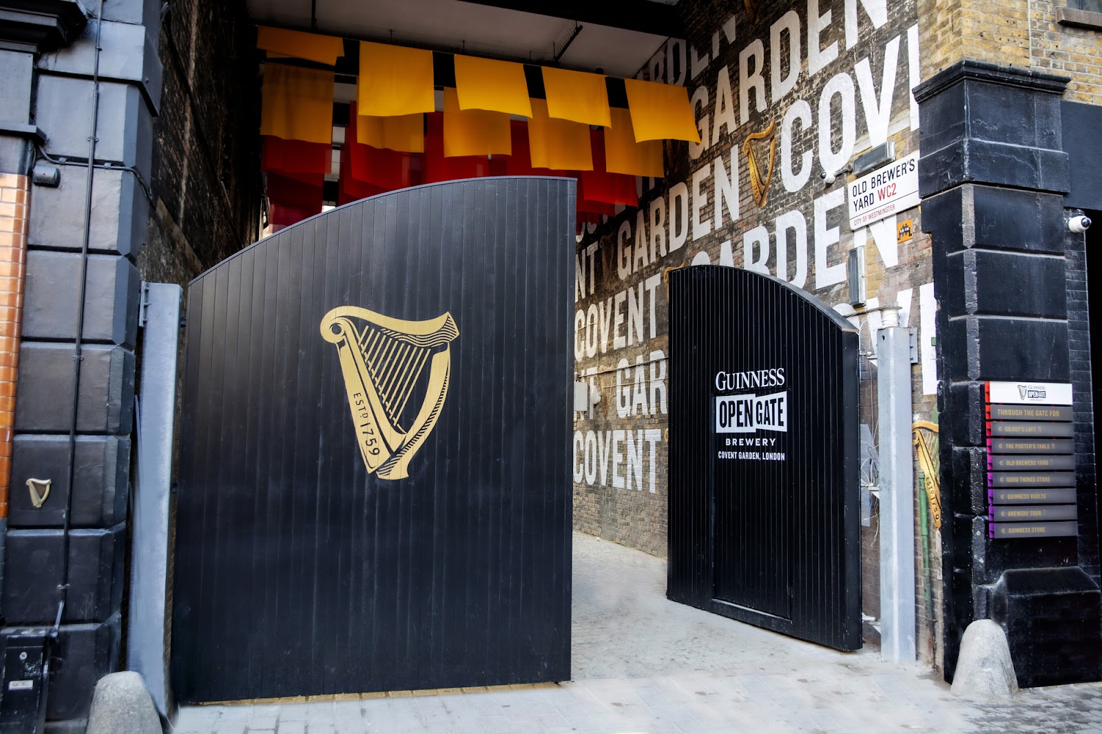
On January 5, the new visual identity and wayfinding system for Guinness's new home in Covent Garden, London, was unveiled. 5,000 square metres spread across three historic buildings. A maze that could have become frustrating, if it hadn't been for the work of studio Dalziel & Pow.
"Edible" design: The beer sign
The brilliant idea starts outside. Instead of using the classic aluminium signboards, the designers created directional panels that imitate the perfect pint. A matte black base and a dense white "foam" on top. It's not just a sign: it's a psychological prompt. Before you even walk in, the brand is already telling you what you'll drink. Beneath the surface, each building has a distinctive colour that helps visitors understand where they are without having to read complicated maps.
Physical user experience: The return of the Toucan
Inside, the signage stops being purely informative and becomes a character. In collaboration with illustrator Mason London, John Gilroy's historic icons—the toucan and the sea lion—have been brought back to life.
More than arrows: The animals interact with the architecture. A toucan peeking out from a stairway doesn't just tell you to "go this way"; it turns getting around into a little discovery.
Bite-sized content: The walls are dotted with hand-drawn tidbits about the history of beer. It's the same principle as the information we read during waits in video games: entertaining visitors as they make their way from one point to another.
Retail and Personalisation
The project also includes spaces where the experience culminates in bottle personalisation. Here, industrial style meets wall illustrations and digital screens, creating an environment that can change its look based on collaborations with artists and other brands.
Graffico's Takeaway 🔴
Why are we analysing the opening of a venue in London in a journal about technology and business? Because wayfinding design is the physical equivalent of theuser experience of a website or software programme.
This Guinness project teaches us three fundamental lessons for every digital product:
Function isn't enough: A sign that says "exit" works. A sign that says "exit" in your company's style creates an emotional connection. Don't settle for programmes that "work"; aim for tools that "speak".
Reduce effort through enjoyment: Finding your way around 5,000 square metres can be tiring. Using illustrations and tidbits reduces the mental load of getting around. In a programme, this means taking care with transitions and confirmation messages.
Consistency between form and substance: If you're selling a high-end experience, every detail, from the arrows pointing to the retail area to the writing on the walls, needs to communicate "Quality".
At Graffico, we believe a business dashboard or digital shop should guide users as naturally as a toucan guides you to a pint in London. If customers have to think too hard to figure out where to go, the design work has failed.
Ready to bring your ideas to life?
Request a free, no-obligation consultation. Let's talk about your project.
Request a consultation